
Redesigning website for venture capital firm
My Role
Update Brand Identity
Sitemapping
Wireframing
UI Design
Overview
The Challenge
The current website contained content that was not useful to the users. It was text heavy and had no proper structure which amplified confusion rather than coherency. Aesthetically it did not reflect the company's current brand image and needed to make it stand out from their competitors.
Research
We had first sat down with key stakeholders to understand their brand vision, overall goals and challenges. We needed their perspective on internal business needs and external context on the industry, competitors, best practices.
Key Findings
• The company focused on growth stage digital companies who have already hit the ground running
• Their expertise is in the tech industry of the canadian market
• They provide more than just capital, assisting with marketing and networking to grow the start up
• Their primary users are tech-savvy open-minded entrepreneurs
• Their primary objective from the website would be for potential clients to reach out for a meeting
Competitors
An analysis was done of companies that were both direct and indirect competiton. We audited information structure, layout, tone, navigation. We put the stakeholders in the role of their users and took feedback from these sites to as what they would be most pleasant user experience.

Conceptualization
Sitemap
We began by creating our navigation tab informed by the research we did on the users and goals of the website. To simplify the user flow of the site we went through each tab and organized the placement of content. While doing this we removed unnecessary pages from the previous website, merged existing information and also added in new content where needed.

Wireframes
Wireframes were the next step, to define information hierarchy, plan layouts, map a more efficient page flow and create call to actions to lead the user through to the story of the company and how we wanted them to process the information. Once we got feedback from our stakeholders and got the green light, we moved on to designs.

The Redesign


The 'Home' page needed a strong hero image accompanied with a statement headline to establish the brand tone and voice. A Call to action (CTA) button was placed to direct the users to the ‘About Us’ Page as through our research we understood it to be of prime importance to potential clients.
Scrolling to the next section showed a slider of testimonials from happy clients and a CTA was placed to direct to the companies page as we had researched that would be of secondary importance to the potential clients while also portraying trust to potential leads.
The ‘About Us’ page contains different sections of information about the company, broken down into sections to flow with the content with a CTA leading to the contact page.


The team was small in the company but each member was powerhouses on their own. They had an extensive social media presence thus we had kept their bios short and provided links to their social media accounts and the profiles of the companies they have worked on.

The main purpose of the site was create an emotional impact and resonate the updated brand identity of the company while creating a great user experience in navigating the site for information that was most important to potential users and eventually for potential leads to reach out by filling in the contact form.
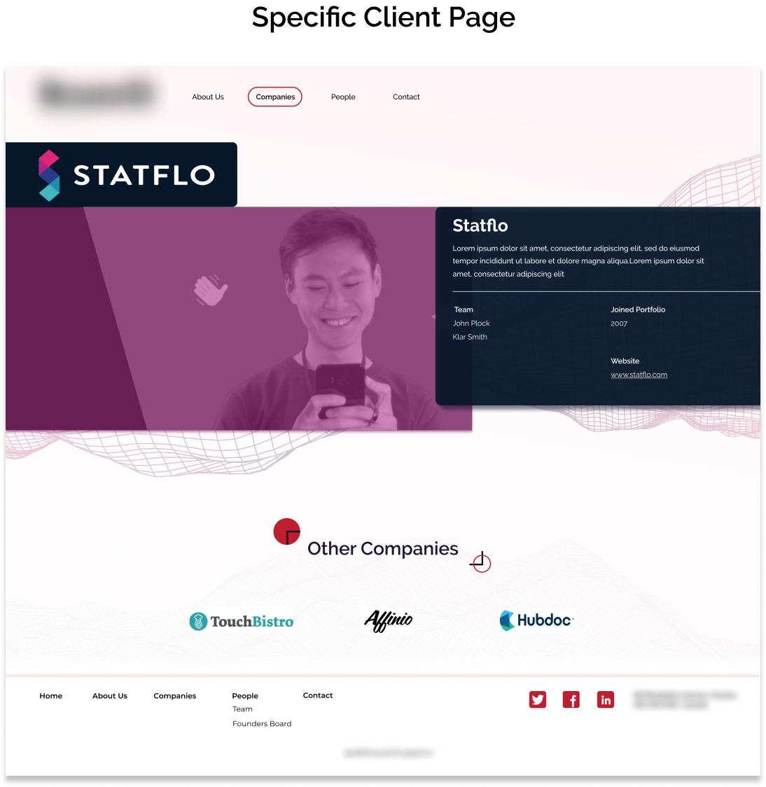
The company portfolio page was important to establish trust for the clients to see what kind of companies they have worked with, what kind of network they had and if it is the right fit for them. The same visual styling was consistent throughout these pages.
Future Considerations/
Learnings
Ideally, I would have liked to spend more time in the research phase. A usability test of the old website with users would help with finding key pain points to better improve the user experience. We had to adapt to our resources and replicate some of these processes internally. In the end, the clients were very happy about the final product.
Previous Case Study